What is ADA Signage?
The Americans With Disabilities Act (ADA), regulates signs posted in public buildings to ensure they comply with specific requirements. ADA requires that these signs are conveniently located and read; both visually as well as through tactile touch. Guidelines for design include sizing and spacing of fonts, braille, and pictograms. OAI Visual Branding welcomes technology capable of creating custom signage that meets all ADA regulations!
Size & Space
At OAI we value accuracy, which is why you can depend on us to create your signage with precise measurements in accordance with ADA. Regulations require that all text, braille, and pictograms have a certain amount of clearance surrounding it. The most common text height for this type of signage is 5/8 inches which requires 2 inches of clearance per line of text. Utilizing size and space can be tricky, but our expertise makes it easy!
 Font & Finish
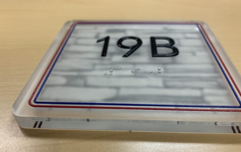
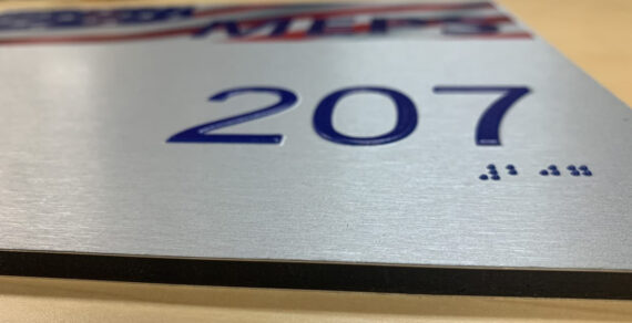
When it comes to fonts and finishes you can count on OAI to know your options! We simplify the decision-making process while remaining within ADA regulations for your convenience. Did you know that tactile text is used across all ADA signage? This means that it feels risen to the touch. You must use a non-glare finish for printing backgrounds and characters on ADA signage. Fonts are sans serif and are printed in medium or bold weight. On this type of signage you do not include italics, scripts, or difficult to read characters. Helvetica, Verdana, and Futura are some examples of ADA approved fonts!
Braille
Here at OAI we specialize in printing Grade 2 Braille on our ADA signage. This is the most popular grade of braille! Grade 2 differentiates itself because it is not a “letter for letter” translation of the text. This type of braille has 265 contractions, as well as many cell combinations which represent common words. Braille is always printed directly below the text. For more information regarding ADA signage, click the button below for a free consultation!


